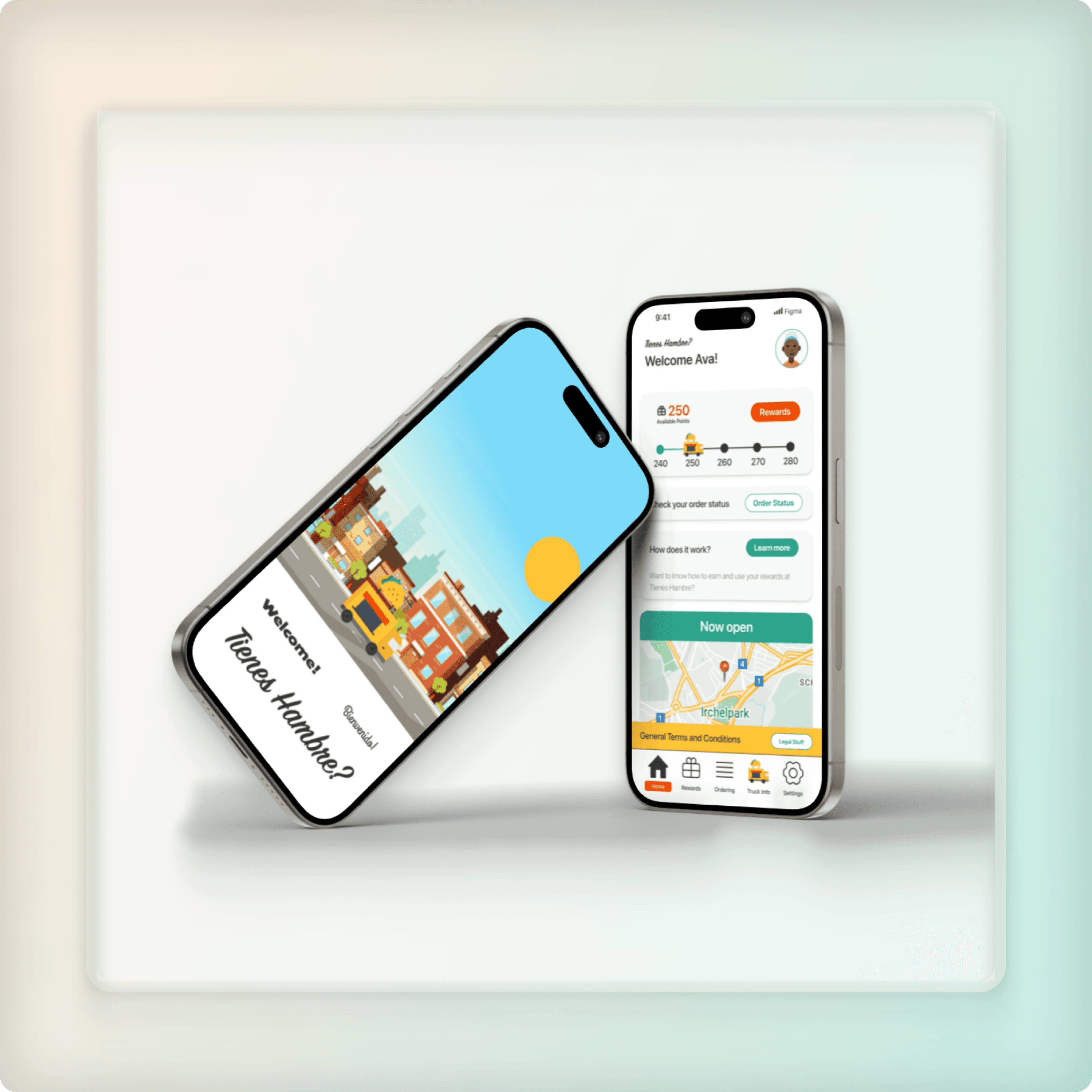
Tienese Hambre?
Redefining loyalty reward systems
Bucking the trend of regular loyalty reward systems by putting the User in complete control of their rewards experience
Date
TL:DR
Key Insight:
People will engage more when they feel more in control of what they feel is theirs. Inflexibility kills joy.
Idea:
Give Users complete control over their rewards with partial discount usage.
Prototype:
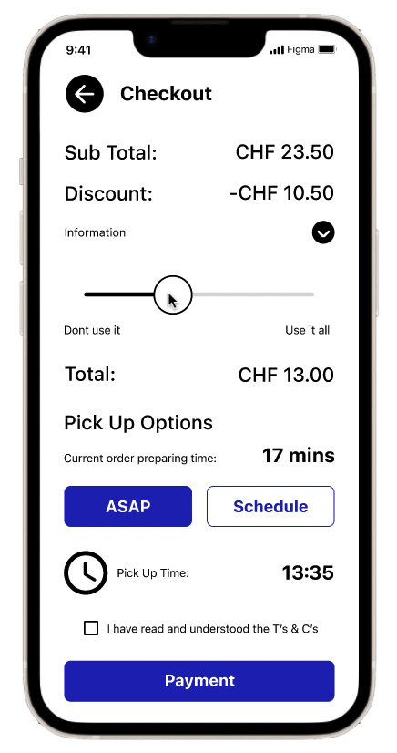
Created a feature for partial discount implementation at checkout.
Feedback:
'An interesting way to lower the barrier to entry for discount usage.'
Learnings:
First ideas are valuable, but only the beginning of the process.

Background & Problem Statement
Food is life in Scotts world.
Having started out in Finance, he now runs his own food truck, Tienes Hambre.
Scott thinks it would be cool to give something back to his customers in the form of a loyalty bonus.
However, when talking to his customers, his feedback was that in general, Loyalty schemes were described to be 'old-fashioned' and 'not offering enough value reward'.
We wanted to help Scott give something back and modernise the experience to make the user feel that they were getting real value.
The goal was to enhance the UX of his Loyalty reward app to improve customer trust, engagement and drive more sales.
User Research & First Thoughts
“Over 80% of the users interviewed agreed that being able to share rewards and have control over the usage of rewards would make the experience more enjoyable and more likely to engage.”
First thought:
Could we ‘buck the trend’ and offer Users a way of using only part of their rewards?
Our immediate goal was to build an App that allows reward sharing and offers Users 'partial discount' functionality.
MVP and Thinking Validation
By giving users a lower-barrier to entry to using their discounts, it removes the feeling of the negative experience of having a huge minimum spend before discount is available.
Adding a feature which allows the User the ability to apply partial discount on their order greatly reduces this feeling of 'one-sidedness'.
Initially, we decided to implement a 'slider' feature which gave the user the option of using anything between 0% and 100% of their available discount.
Before: Intuitive, but difficult to define/refine the amount of discount
Sadly, Users found this screen very confusing and were dissatisfied with the accuracy of the Slider system. Not enough visual feedback.
Our usability studies told us that the Slider feature was a bit confusing, so we introduced a different format for the 'Adding Discount to an Order' user flow.

After: Radio buttons and clear numerical values added for discount validation
Further User testing was carried out to fully refine the experience based on User feedback and insights

After iterative testing on my Prototypes, the User completion rate for both key paths was high enough to be confident in the User Experience Design.
Results & Business Impact
This User Flow offers Users a way of having total control over their loyalty spending.
We ‘bucked the trend’ and offered Users a way of using just part of their rewards during their purchase cycle.
This meant the App had direct impact on all Users by lowering the barrier to entry to actually using the discount scheme.
Key Learnings
Whilst a well-structured UI/UX strategy can significantly impact business outcomes, dont overcomplicate things. First ideas are always valuable, but they are only the beginning of the process.

